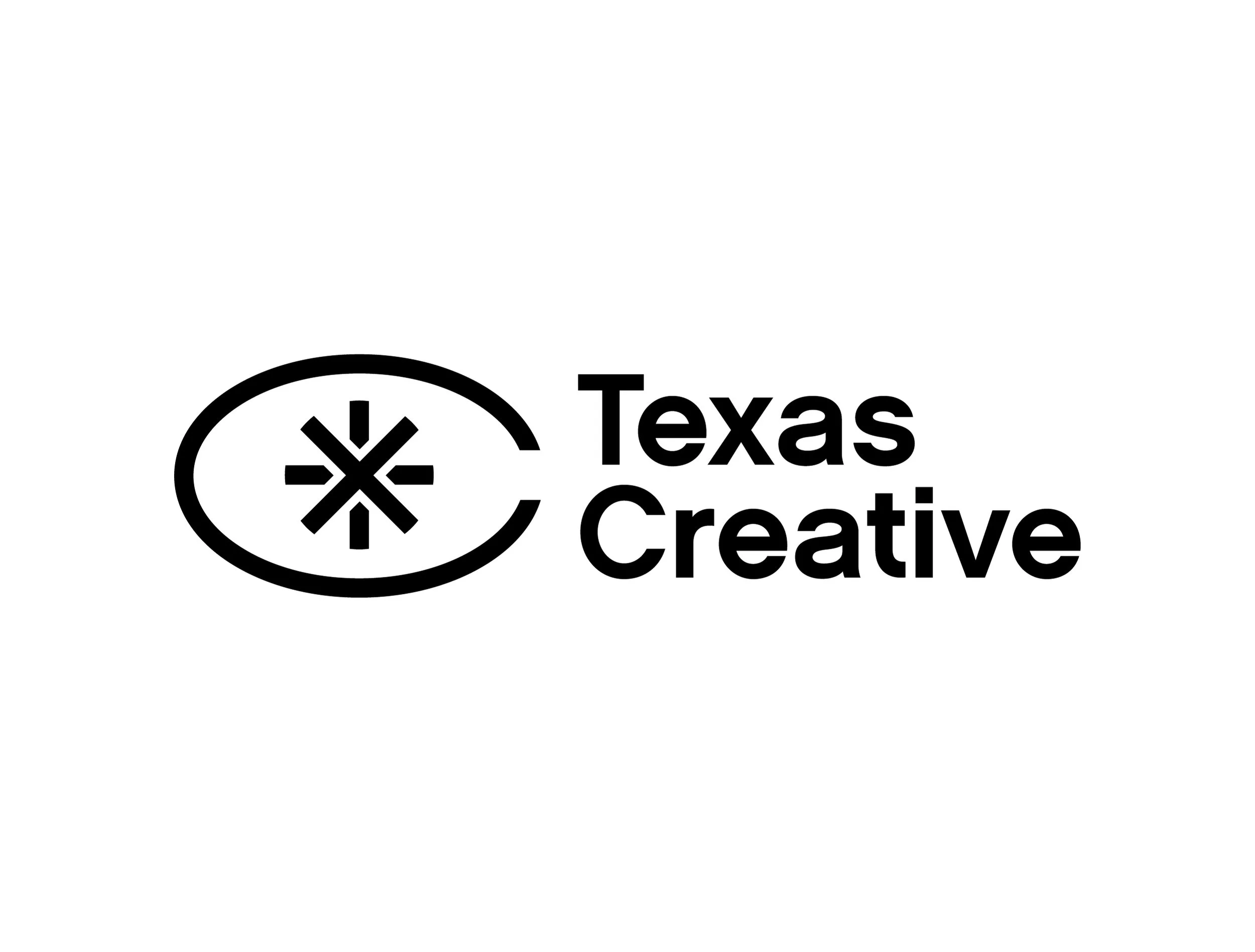
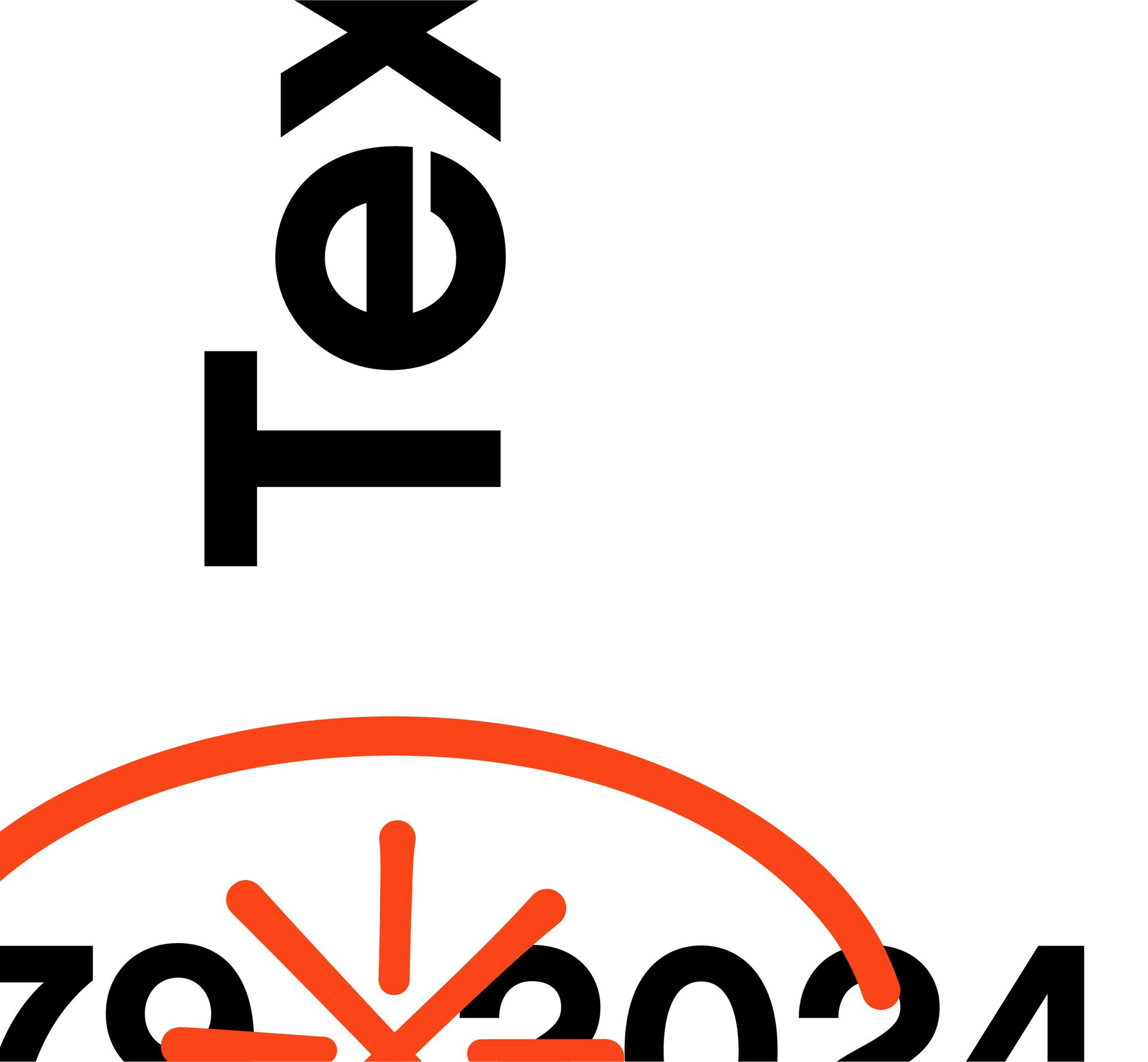
A deceptively simple brand mark.
A stacked T and X sit in the center with an elliptical C as a holding shape.
By layering these symbolic letterforms, we see an entirely new perspective.
The resulting shape resembles a wide-open eye.
01 /


Celebrating 45 years of excellence.
To make the most of an anniversary year for this celebrated portfolio program, additional sub-identity elements were created.
As a nod to the red ink marking up idea thumbnails, the eye mark and anniversary numerals overlay in special lockups or seals with more of a hand-drawn effect.
03 /
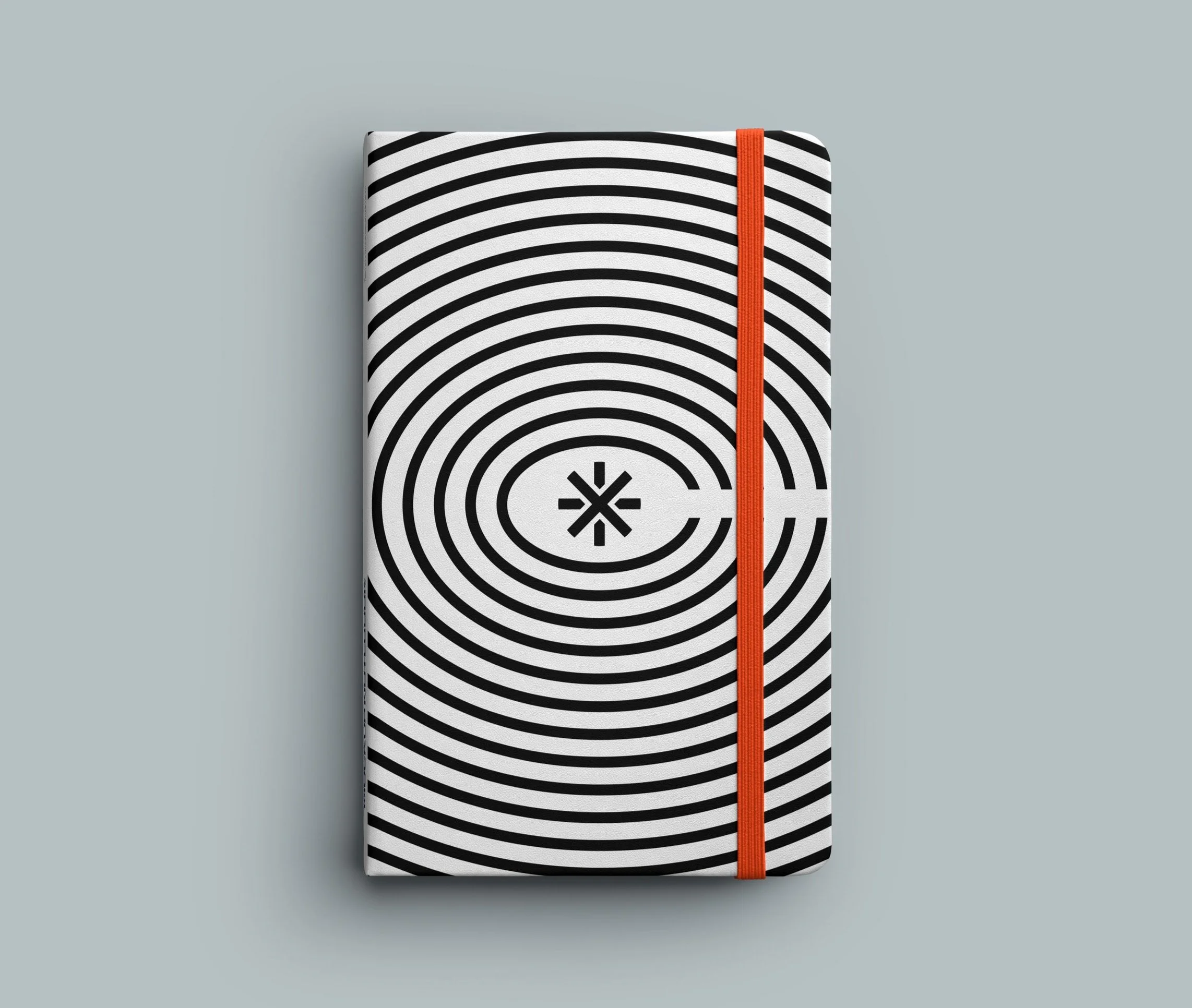
From brand mark to brand identity.
The TXC eye mark is the focal point of a full brand identity, complete with an array of lockups with the Texas Creative wordmark.
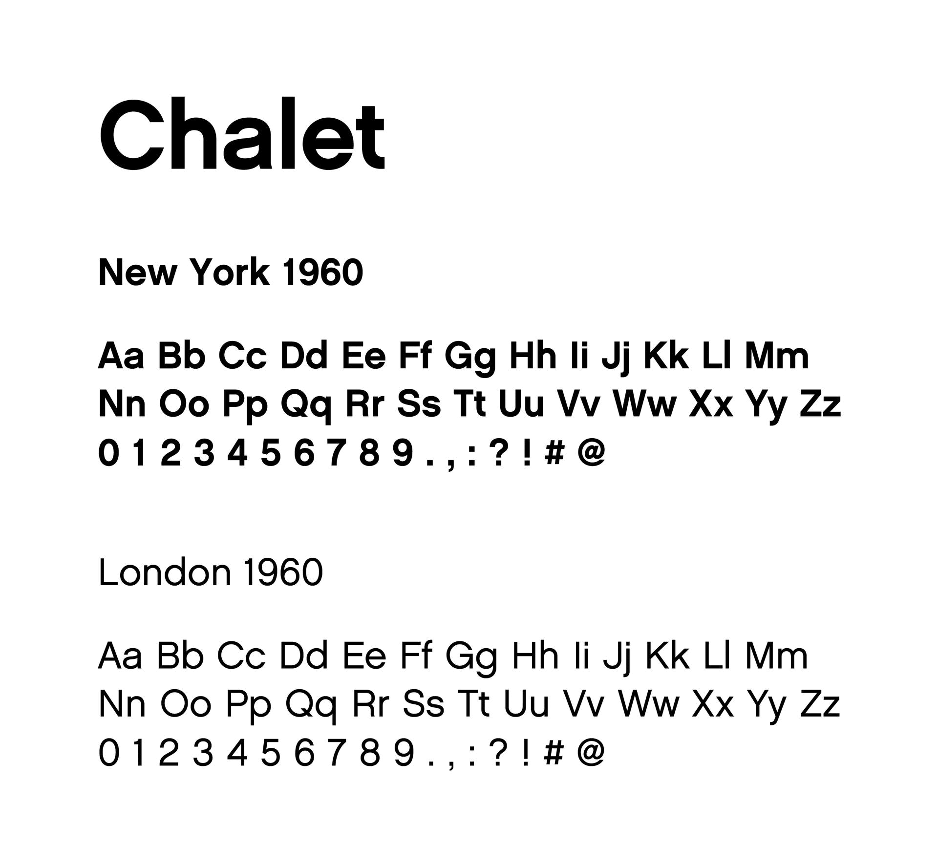
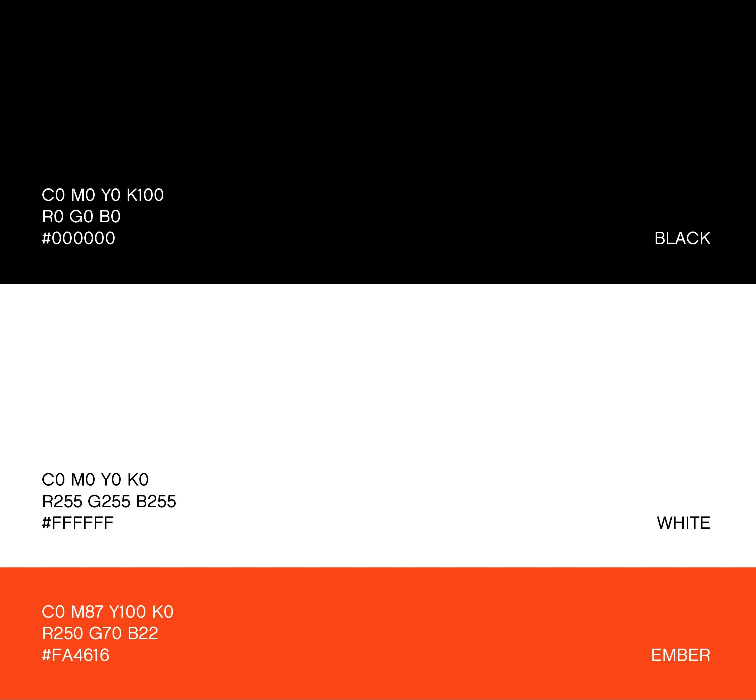
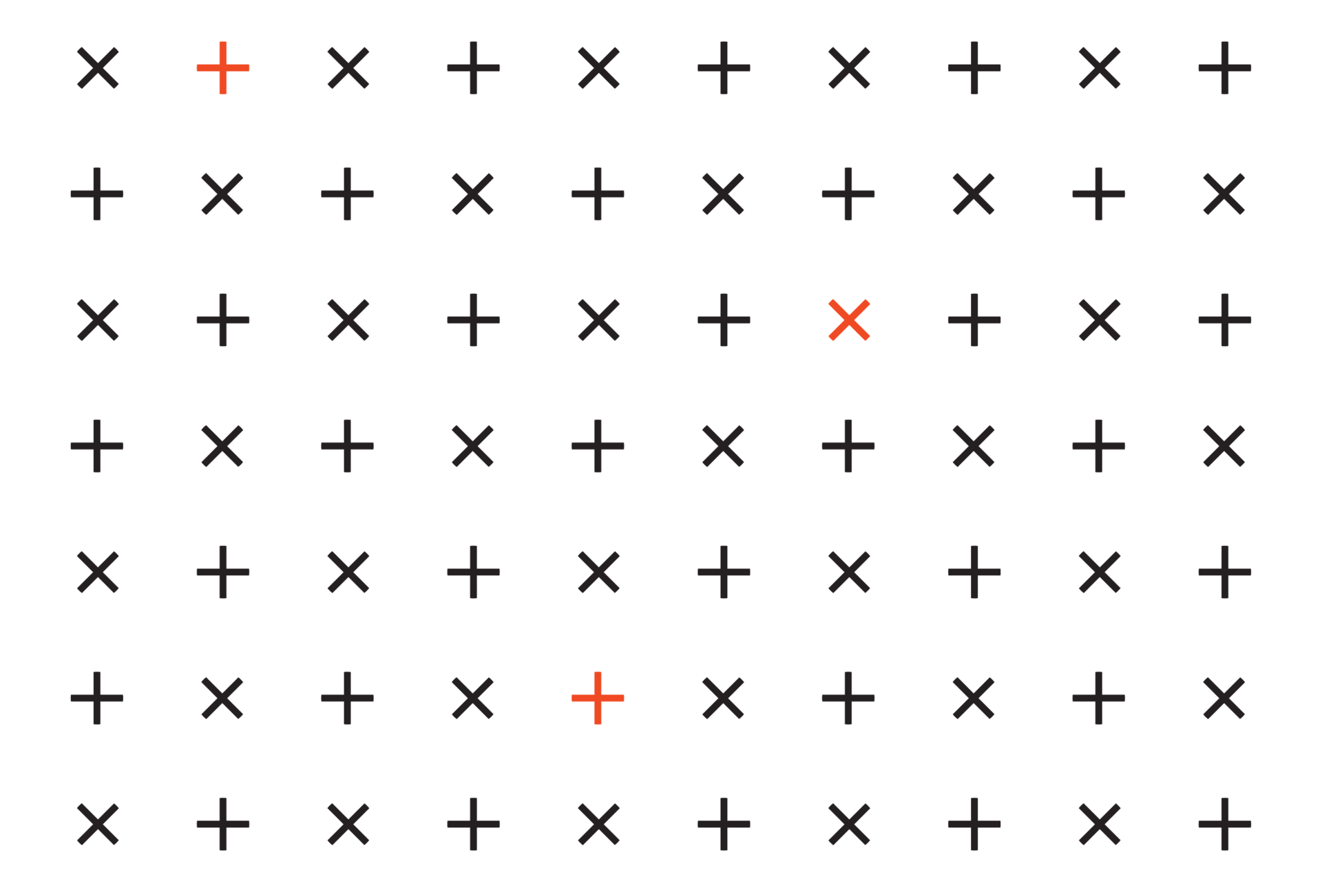
The primary palette of black and white pairs perfectly with Chalet, a nostalgic and unencumbered typeface, while a burst of orange and an array of sleek icons and brand patterns give the identity a future-forward edge.
02 /
In 2024, UT Austin’s Texas Creative portfolio program celebrated 45 years.
A bold new identity that looks back in time and sees the future seemed to fit.
00 /
05 /
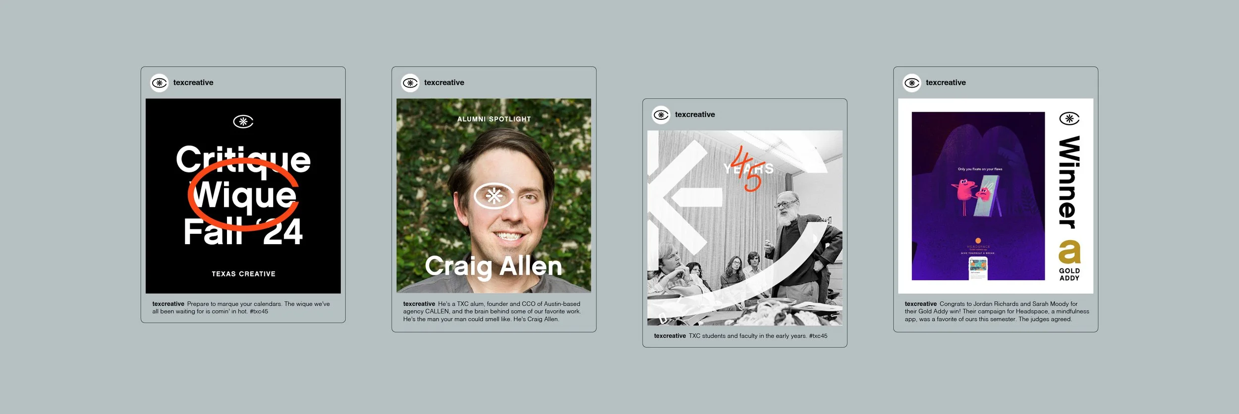
Bringing the brand into the real world.
Upon the launch of the new identity, TXC’s social channels began to take on the new look with a dynamic array of layouts.
And to give portfolio students an added sense of program pride: new swag.

04 /
Credit to:
Looking back and seeing the future.
This comprehensive identity for Texas Creative is a bold step forward for the program. It’s also a celebration of its roots in a different era and a subtle nod to its status as one of the longest-running portfolio programs in the country.
Sean Thompson, Creative Direction Justin Hirsch, Creative Direction Connor Gleim, Art Direction + Design Gwen Donovan, Design Victoria Shaffer, Account Management
06 /
GO TO:
